The Brick and The Machine
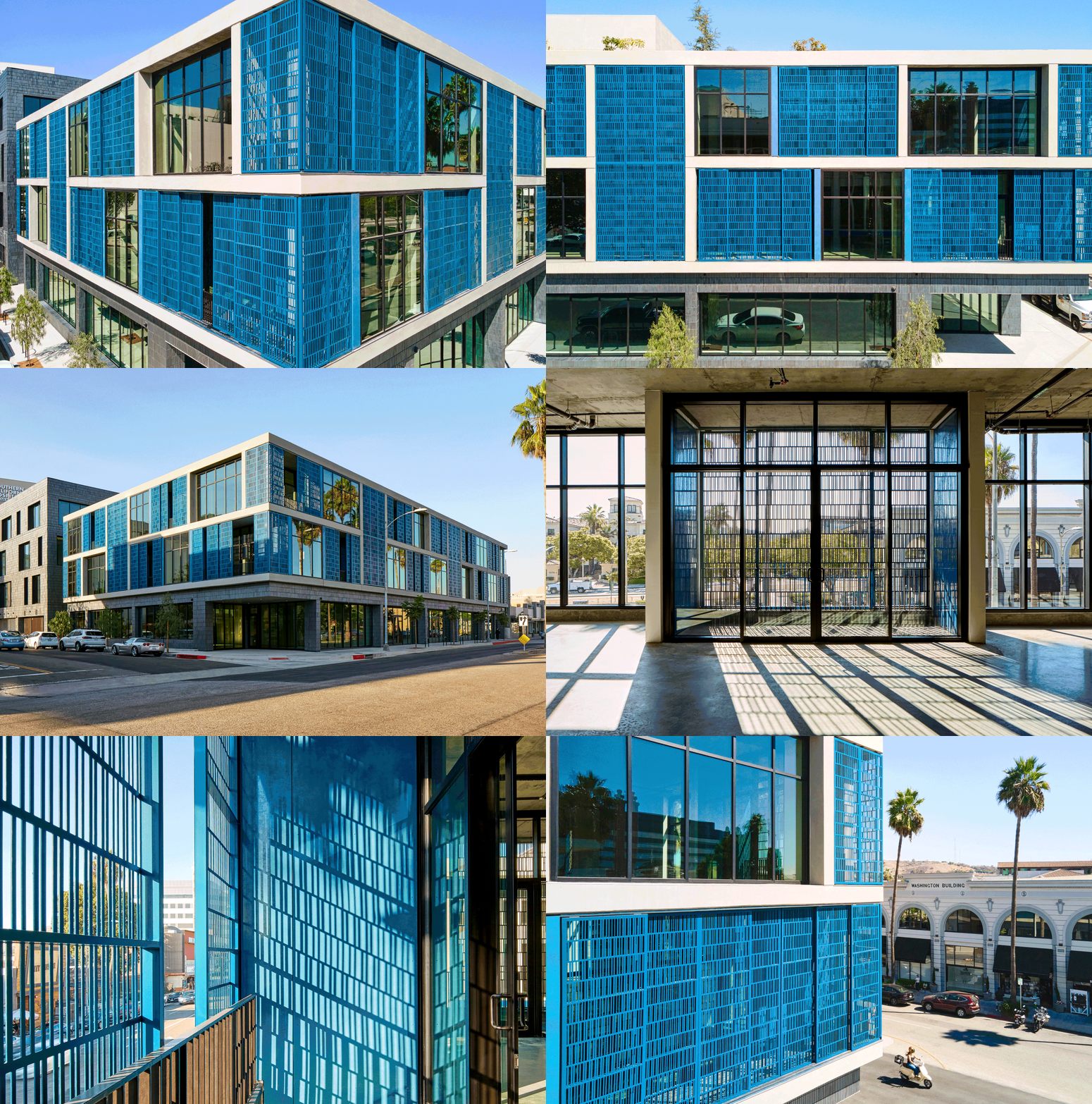
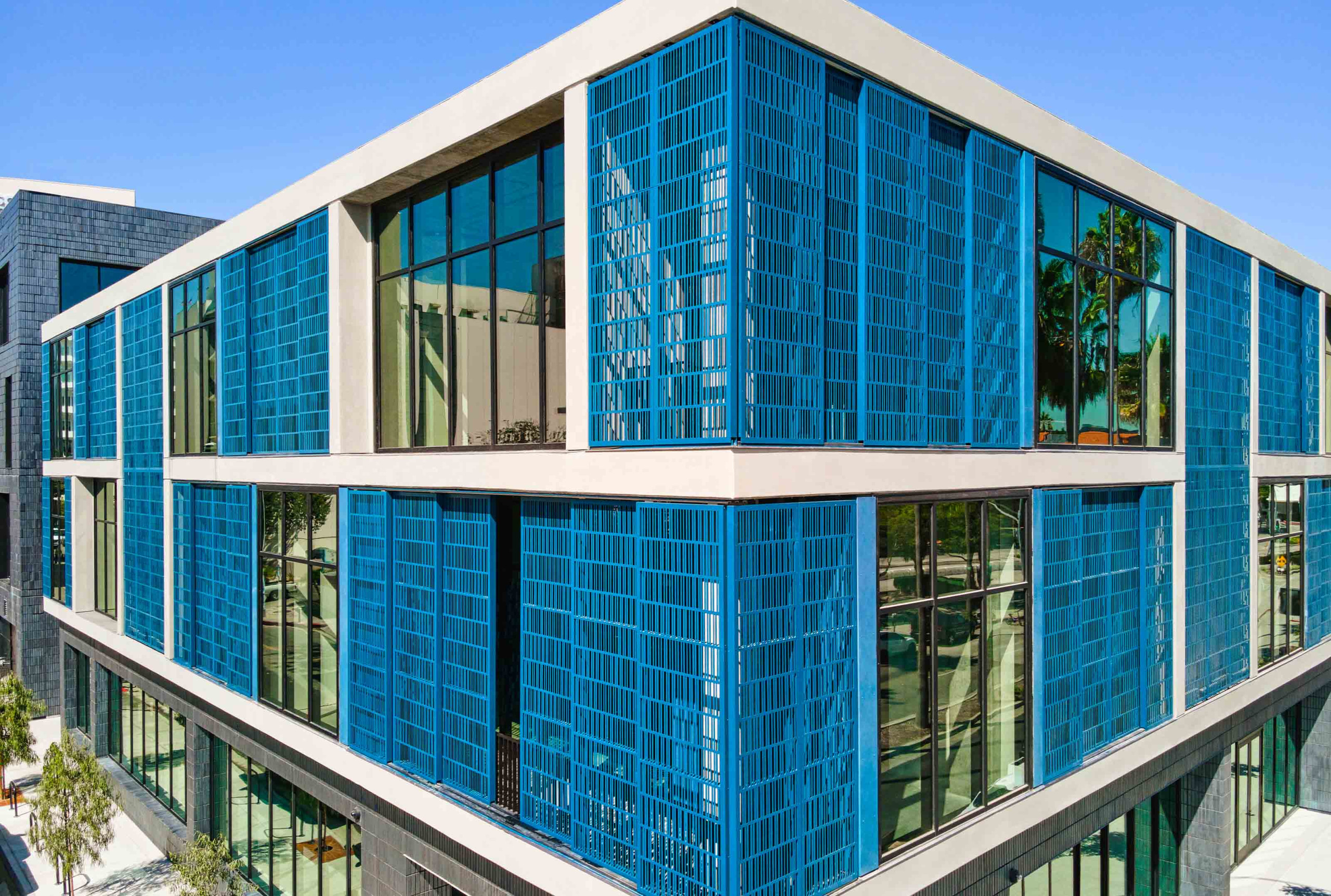
If the perfect solution for your next project isn’t available, build it yourself. This design mantra inspired The Brick and the Machine, a new, mixed-development building in the greater LA area. The size of the new building surpasses 7.618sqm with three floors of office space and a retail sector on the ground floor. A split design, the project is divided between two different style concepts.
Bridging two distinct exterior styles, the building has a painted historic brick facade, alluding to the role of this rustic look in the area. This transitions to a modern taste of the mechanized built environment, bringing this historic look to the future.
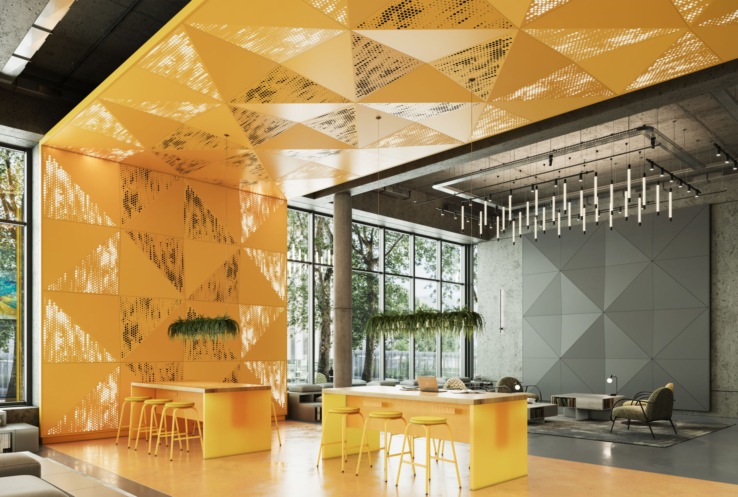
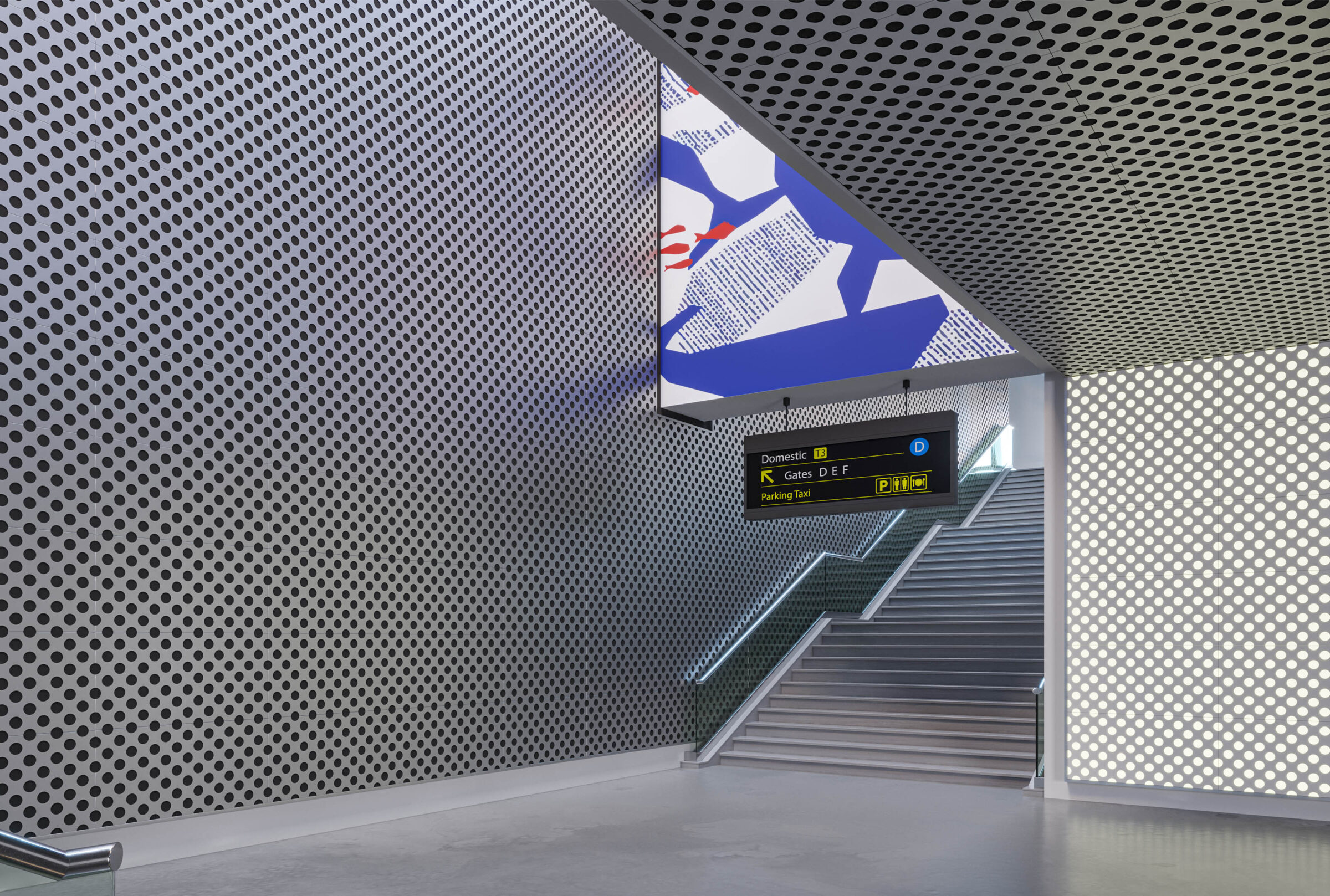
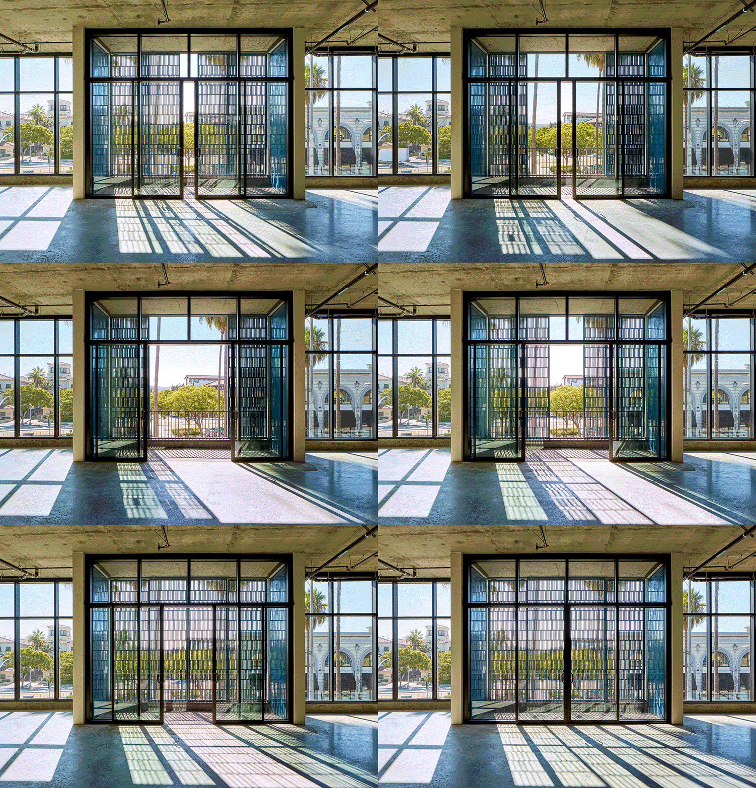
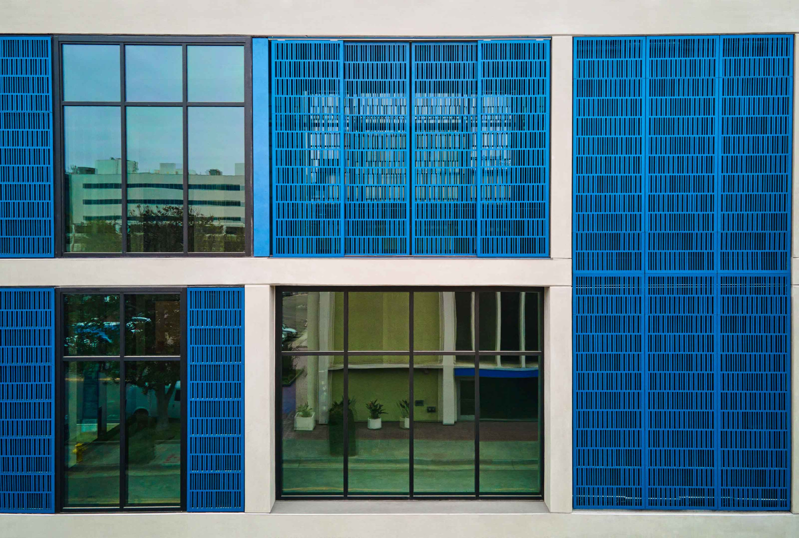
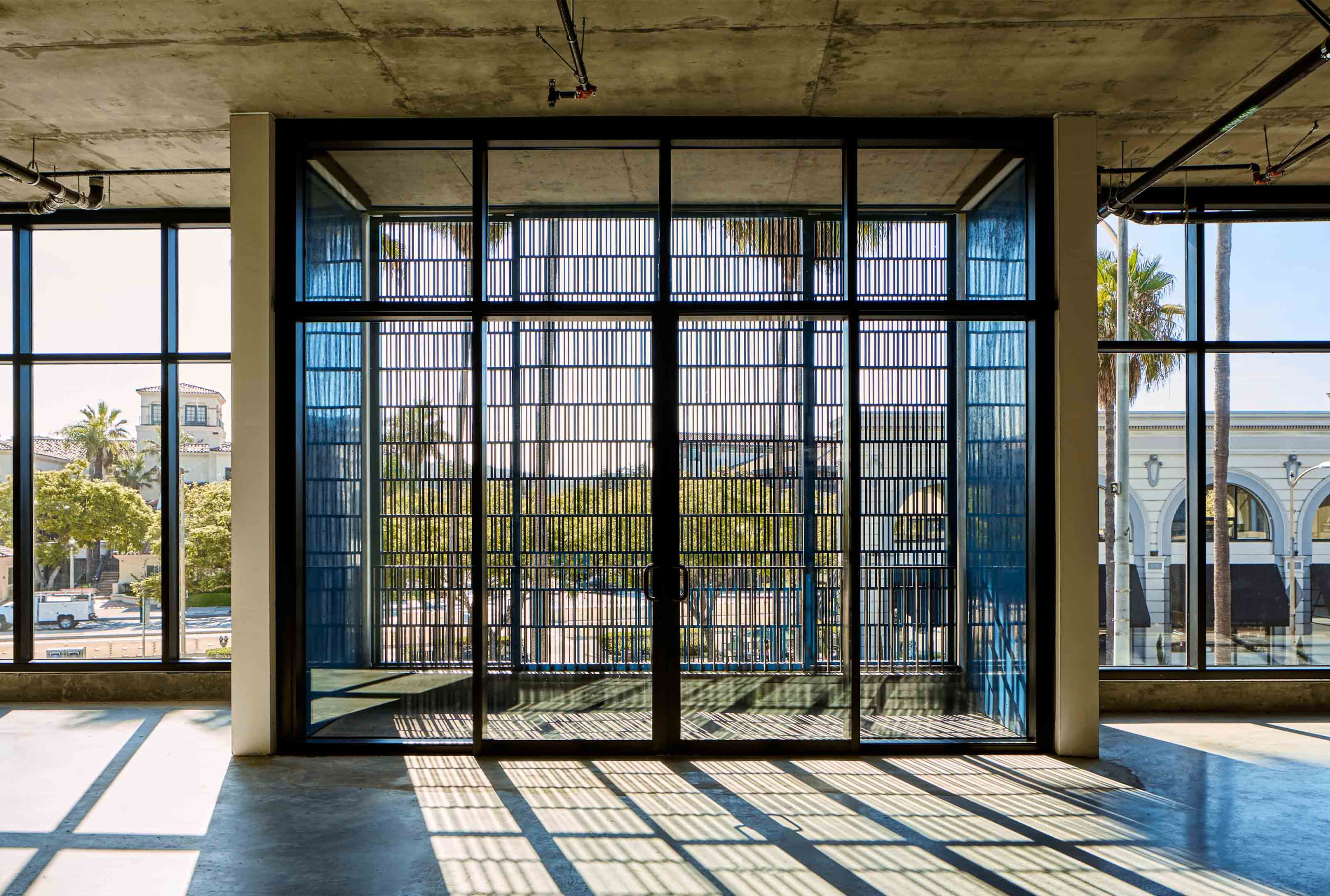
The project features a series of fully custom-made rolling metal panels spanning both the facade of the building and the open-air balconies. The sliding frames feature perforated elements, with some of the panels built rigidly into place. In contrast, others are mechanized, allowing them some range of motion. This movement is a key feature as it enables the finely crafted panels to protect against the glare of the ever-moving sun, which helps control the internal temperature of the building. By repositioning the layered screens, users can adjust light, shade, and privacy levels.
These stunning panels provide a beautiful dappled light effect through design, quality, and durability throughout the space. The finished project provides an exterior facade look that expresses the vitality of the office tenants through an ever-changing look allowing modification to the face of their building.
- Location: Culver City, CA
- Architect: Abramson Architects
- Photography: Sean Costello Photography
